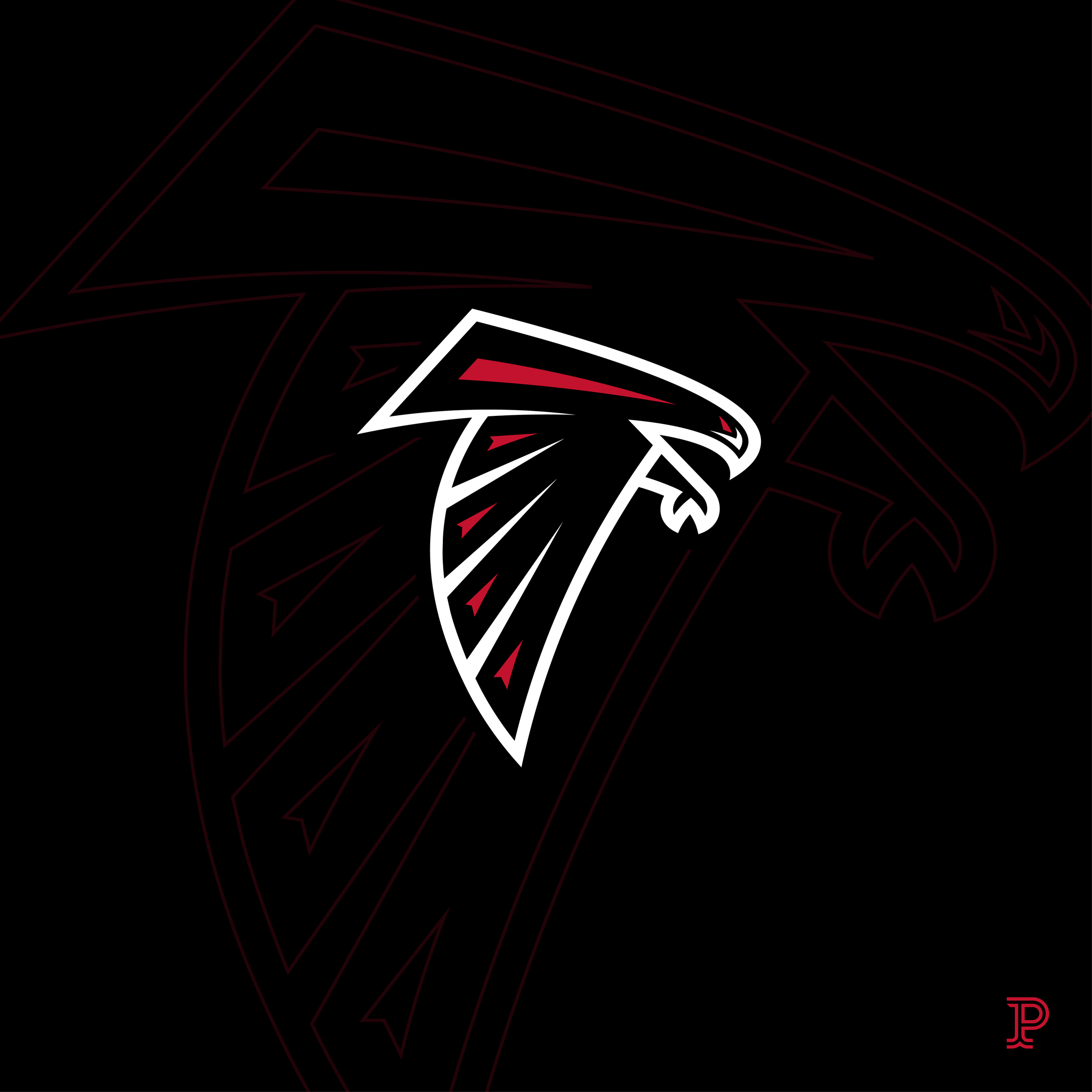
atlanta falcons reboot
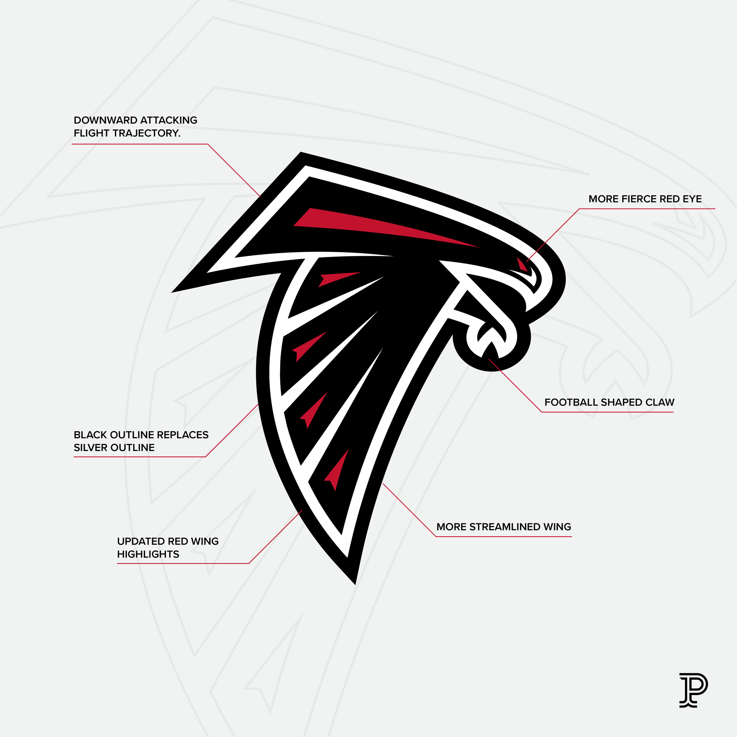
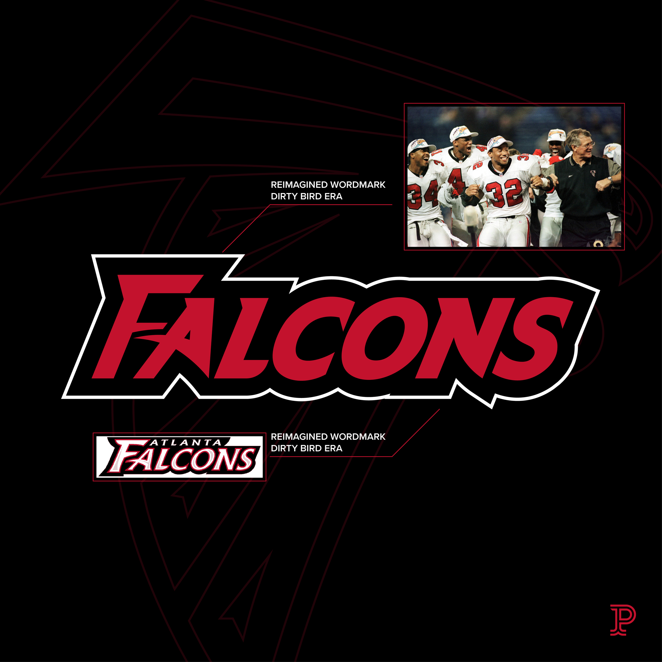
The goal here was to find a happy medium, as well as simplify the design to fit today’s more minimal approach to sports design. I also feel that the logo should be strictly black and red. There are some secondary brand assets included as well. I also wanted to explore the old wordmark used from 97-02, which I feel more aligns with the new design. I redesigned the type allowing it to flow together seamlessly when stacked.
***THIS CONCEPT AND ITS GRAPHIC DESIGN IS NOT ENDORSED OR AFFILIATED WITH THE ATLANTA FALCONS OR THE NFL***
-
Logo Mark / Icon
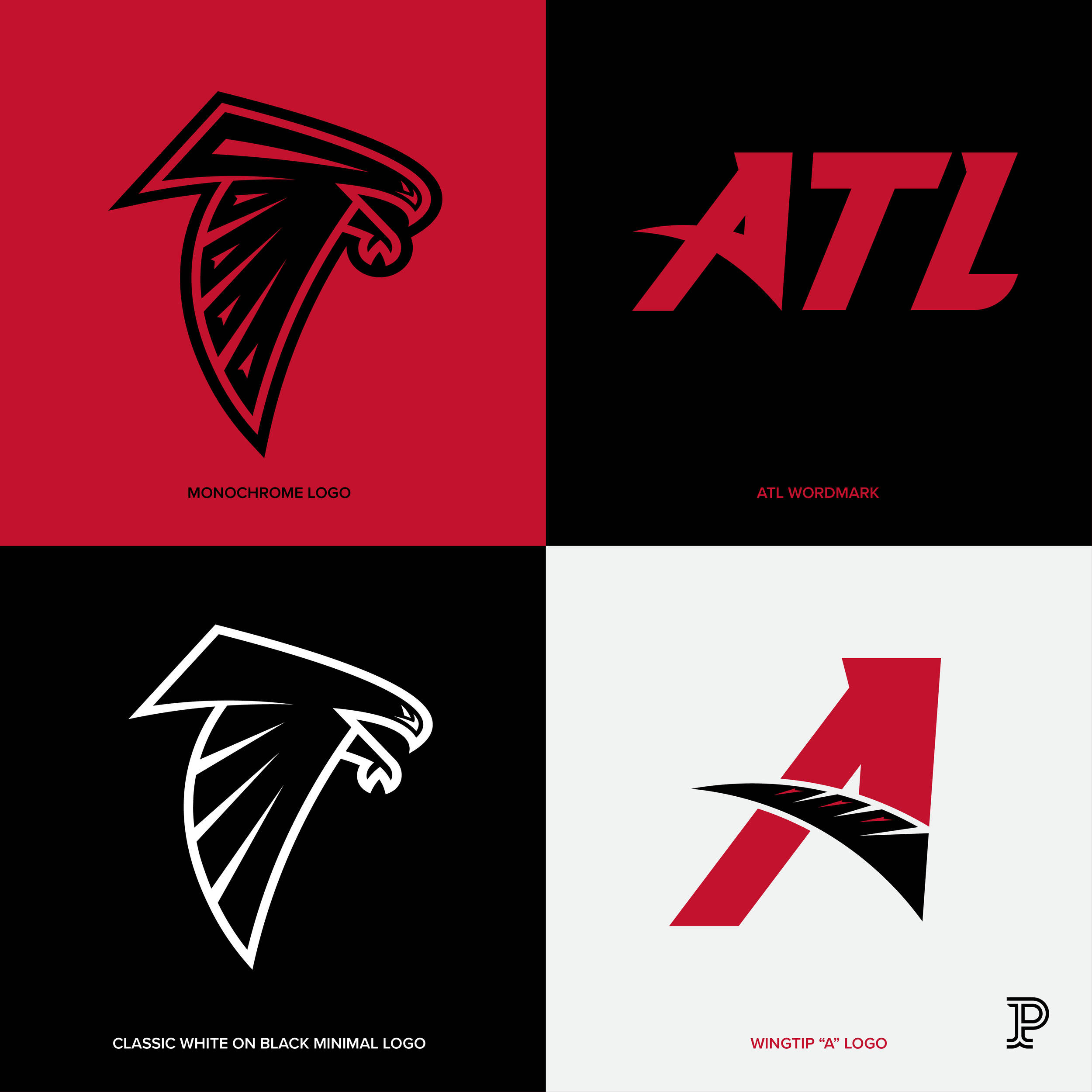
Custom Wordmark
Uniform Design
-
Fierce, Fast, Flight, Iconic