detroit pistons
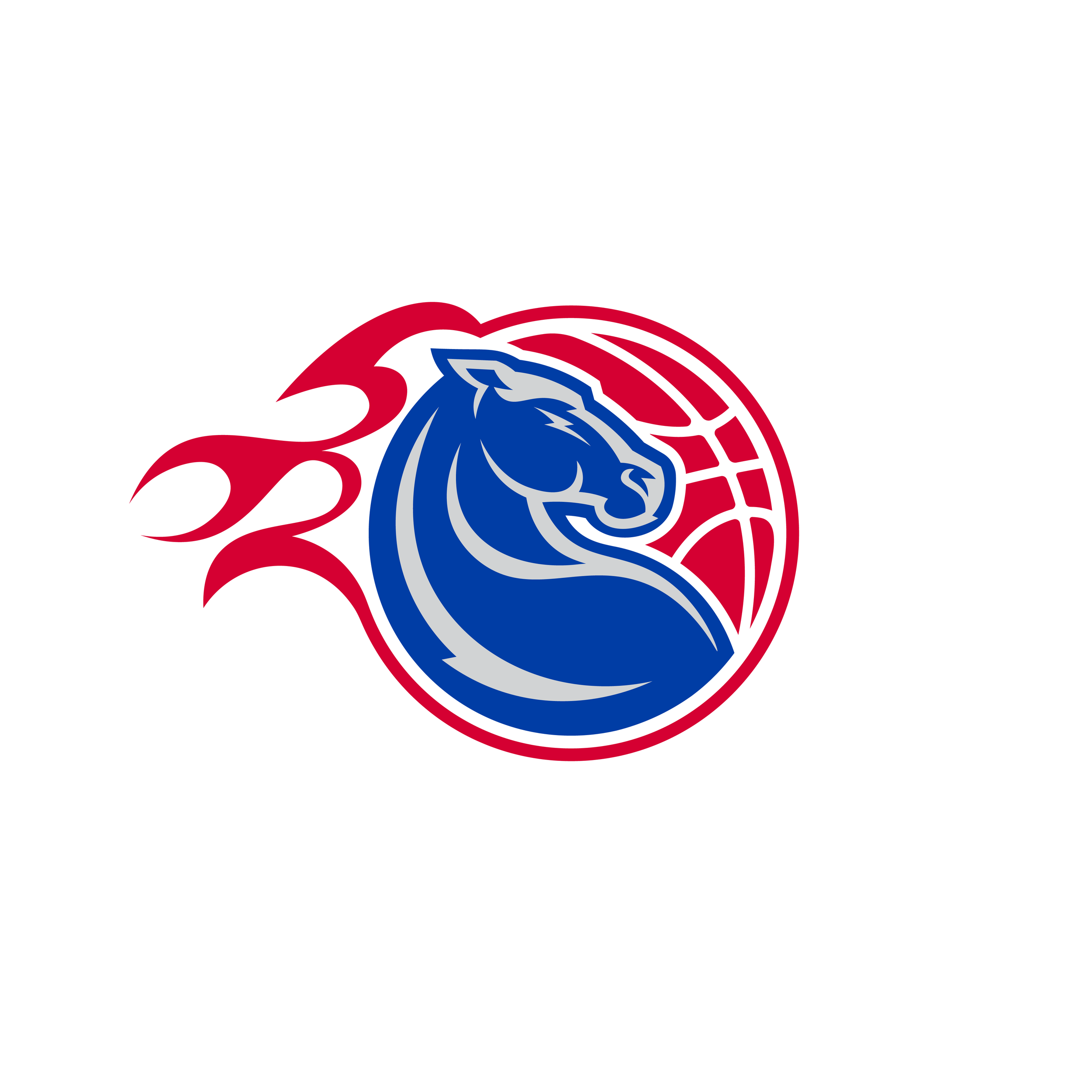
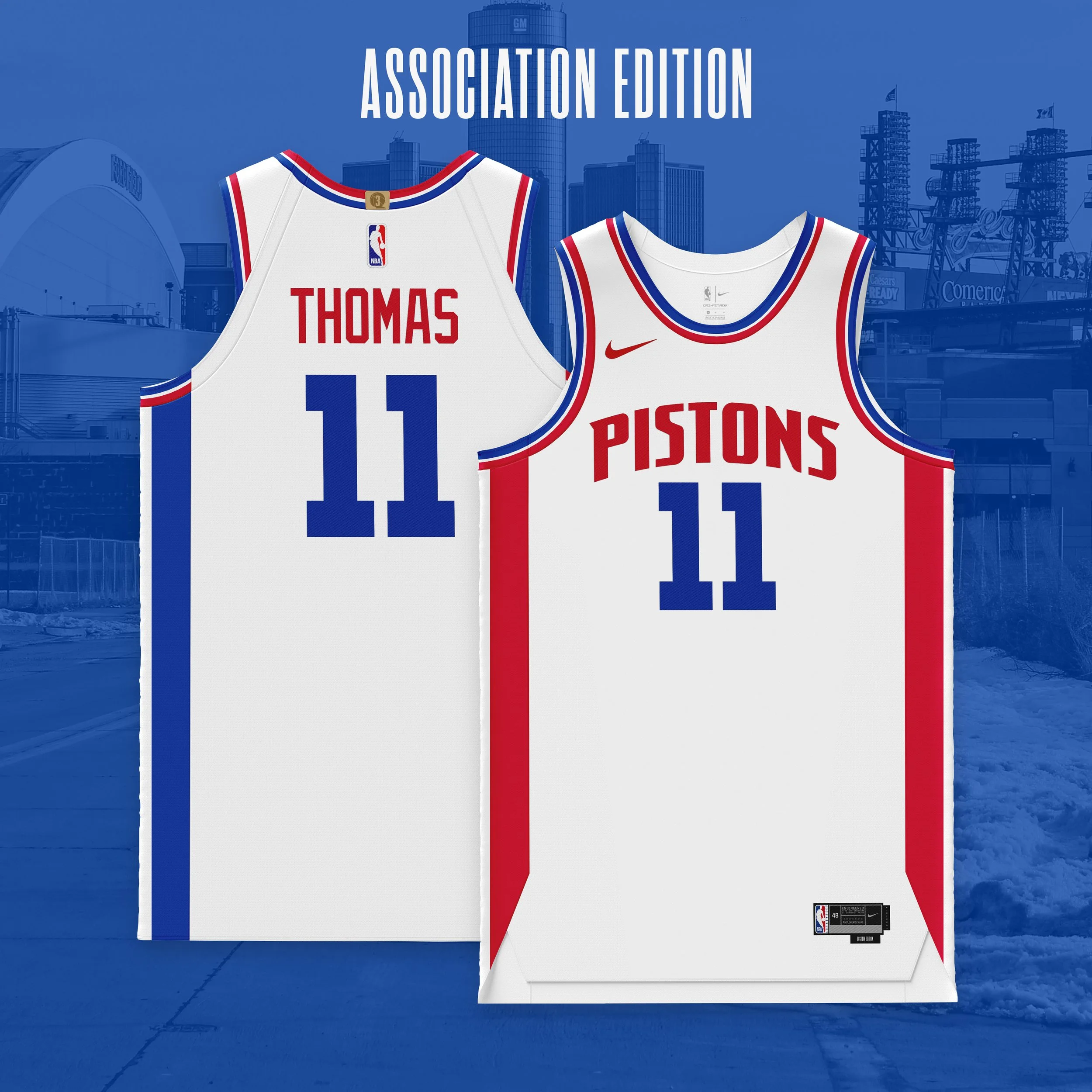
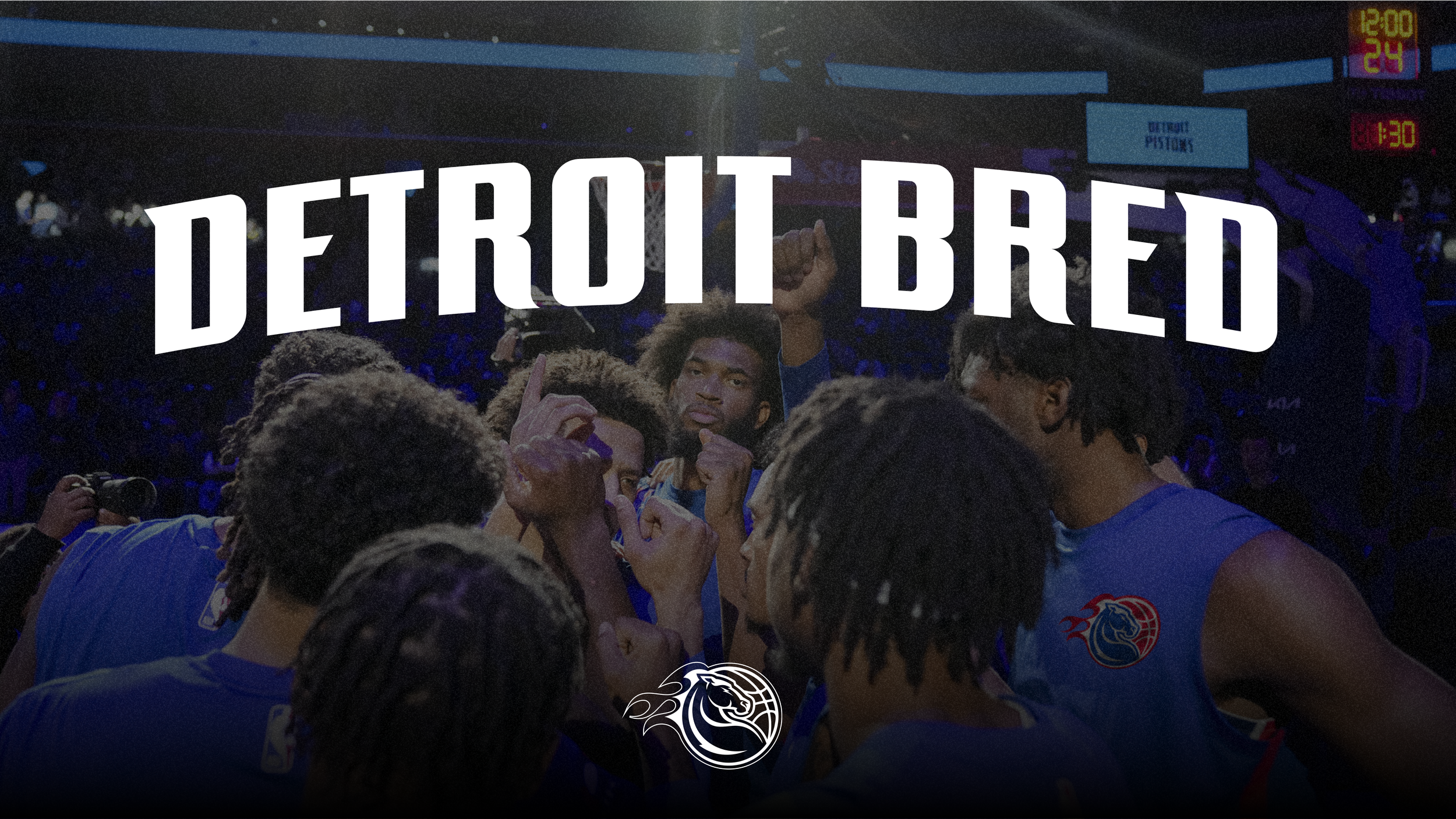
The Detroit Pistons have a long and rich history, which spans the life of the NBA. From Fort Wayne in its formative years to Detroit, the Pistons' brand has always represented the tough and proud city of Detroit, State of Michigan and its loyal fanbase. With already solid branding in place, we wanted to re-imagine what a modernized Pistons brand would look like, using elements from the franchise's past and recognizable marks from Detroit. The goal with this project was to develop a clean, cohesive brand system that would communicate effectively to fans and felt relatable. Having a brand that would flow well within the NBA's landscape was important as well.
The Pistons have used several iterations of their logo throughout the years. Here, we will examine the three most memorable ones. The 1978-96 version is the most recognizable. Its brand equity has carried into today's design, which is a more modernized version of the original. The 2001-04 version is the more illustrative version of the Pistons' brand. When looking at these sets of logos, we came to the conclusion that a true merging of the three would be important as this brand was reimagined.
-
Logo Mark / Icon
Global Branding
Uniform Design
Apparel Design
Print Design
-
Tough, Fierce, Hard Work, Trust
-


